Updates:
11/03/08
With one day left before the election, we posted a new data visualization project that examines job titles (occupations) of donors for each candidte. View Job Titles of Donors.
10/05/08
The latest diagram is updated with August, 2008 factored in. As the data becomes increasinly larger, it's been a challenge to render it into an XML format we prefer to work with. In one case, our machine with 10 GB of RAM was running for 5 days!
We did, however, manage to optimize some key elements in our Java code that helped Processing run faster and deal with larger image sizes. The names of doners are now legible (where they don't overlap). Our dataset has also increased, but we are still working on being able to display all doners on a min 8000px * 8000px resolution that can be printed out on a large poster.
With August, 2008 now updated, the only visibly noticable difference is the growth in the size of Obama's smaller donation segment, though it's quite subtle. It would be interesting to see this diagram take shape from Jan, 2007 on a month-by-month basis...
We are also working on a new diagram with this data involving job titles of doners. Some very interesting results to be visualized. Stay tuned for that in the next few days. -Wes
Overview:
In the heat of election fever, there's been a lot of talk about money, especially in regards to donations for each candidate. It's well known and data proves that Obama has considerably more money than McCain (not including the DNC or RNC financial injections). We wanted to understand these donations and examine any patterns in the type of donations given.
Since the donation information must be disclosed to the public, we turned to the Federal Election Commission to find a data set containing all donors, the amount they donated as well as other information we may try an explore next (i.e. occupation, zip code, employer). The data set time span is currently from January, 2007 through August, 2008 and we will be updating this information every month, as new data is released.
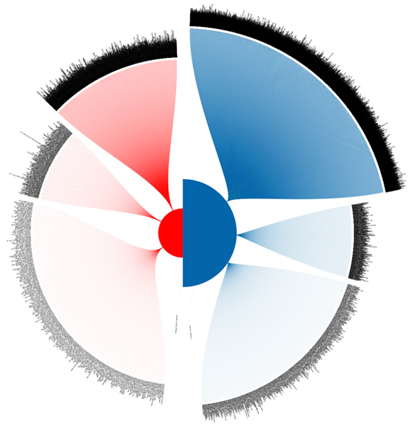
What we had to work with was over 1.4 million rows of data. We used PHP to parse the content and generate an XML file we could easily work with. As lean as we could make it, the XML file was over 110MB in size. Using Processing we rendered the XML data into our visual representation. Taking millions of rows of data, we created this graph to help quickly discern what types of donations each candidate received in a side-by-side comparison.
Clarification on the segments of this image:
While the circles in the middle are simple (the total amounts for both candidates), the outer segments need some explanation. First, the black, hair-like lines coming out are names of each donor don. We felt that the names were a useful visual reference to the density of each category. The actual segments themselves are brackets of donation amounts. The top-most bracket is any donation between $1 and $100, the second: $101 - $500, the third: $501 - $,1000 and the final: all amounts over $1,000. The size of each bracket represents the percentage amount that bracket constitutes in a candidate's total donations.
Results:
What is most striking to us is how much more of Obama's donations come from the $1 to $100 bracket. We found a high number of students, artists, unemployed and self-employed people who fell in this bracket. One can speculate that these are the younger-generation individuals who will be voting for the first time or they are a struggling class of lower income workers. Probably more significant: this shows how much internet contributions have helped the Obama campaign, assuming the smaller amounts were made online.
This data also shows that a majority of McCain's donations come from the $500 to $1000 bracket of donors. The amount is still smaller than Obama's, but this makes up almost two-thirds of his donations.
Final Notes:
The graph here uses a sample of the total data. Using 100% of the data we have, a distinct difference between each segment cannot be discerned unless this was created on an extremely large format (over 5000px by 5000px). Because of this, we sampled roughly 20,000 rows of data from the total (about 1.4%), which is a solid sample set with virtually no margin of error. We also rendered the full-set of data to compare this sample against the entire data to make sure our sizes of segments were accurate.
Credits:
Created by Pitch Interactive.
Concept, Creative Direction, Programming: Wes Grubbs
Programming, Math wizardry: Nick Yahnke
Tools: Processing, PHP, XML

